Research
How competing link shorteners present their product, current approaches to SaaS landing pages, what draws visitors in, and the questions they ask before creating their first link.
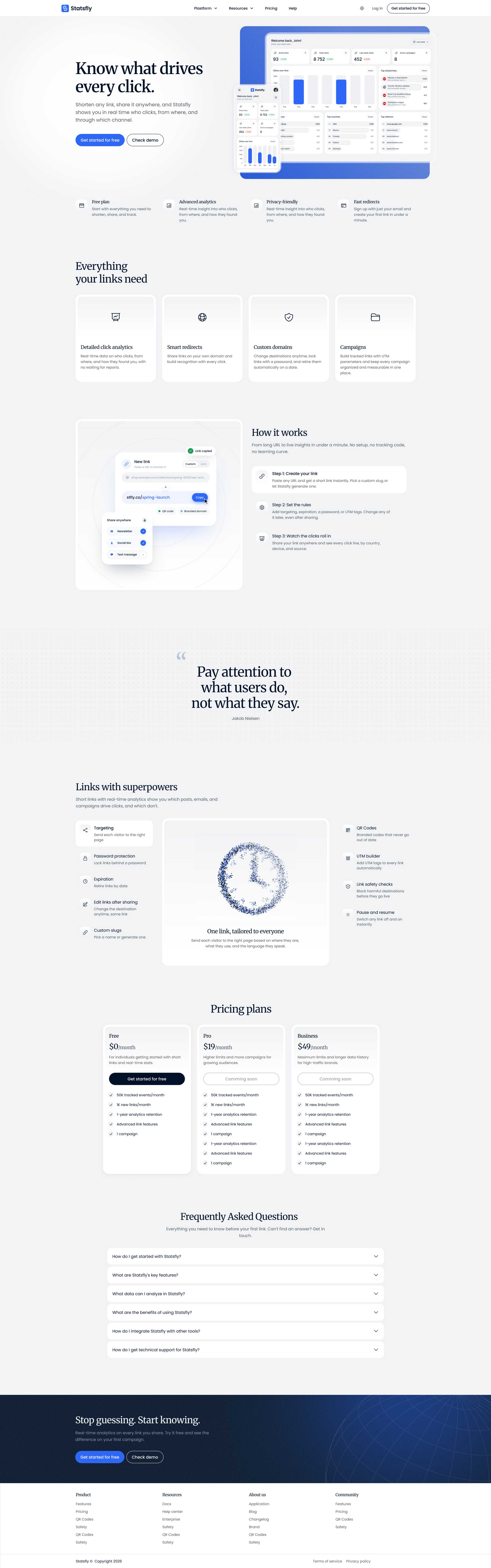
Statsfly is my link shortener with click analytics. It shows which channel, country and device each click came from. I designed and built its marketing site solo, from paper sketches to a prerendered Nuxt site in English and Polish, and all of its text can be edited in Sanity. The site had to explain the product on the first screen and give each main feature its own page.
Check live version statsfly.com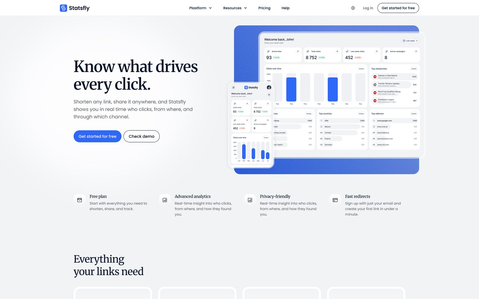
Statsfly records the channel, country and device behind every click. It also lets you decide where a link leads, who can open it and when it stops working. Most visitors read “link shortener” and assume they know the rest, so the site had three jobs.
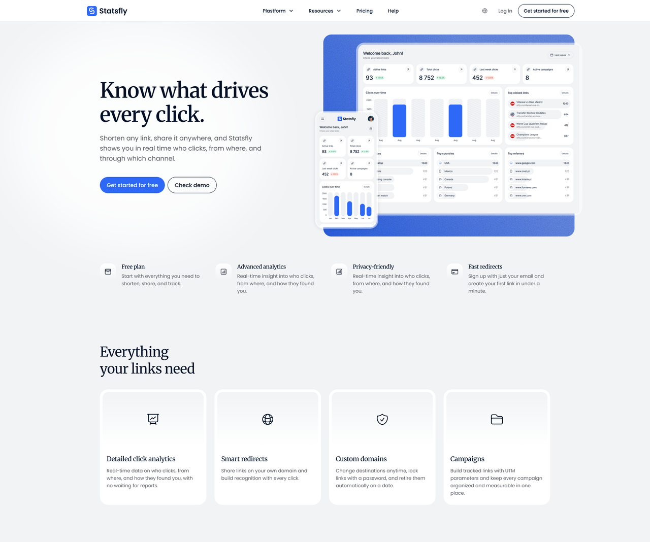
Explain the product in one screen A visitor should know what Statsfly does and see the dashboard before they scroll.
Give every feature room Click analytics, smart redirects, campaigns and custom domains each needed a page that answers the questions the home page can’t.
Load fast in two languages Both versions had to be prerendered, indexable and quick on mobile, with Polish URLs for Polish search.
How competing link shorteners present their product, current approaches to SaaS landing pages, what draws visitors in, and the questions they ask before creating their first link.
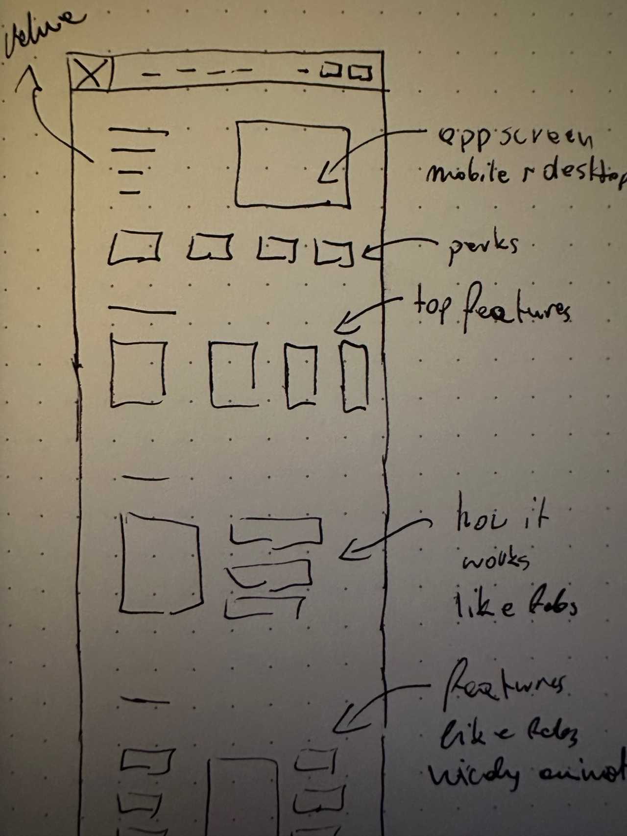
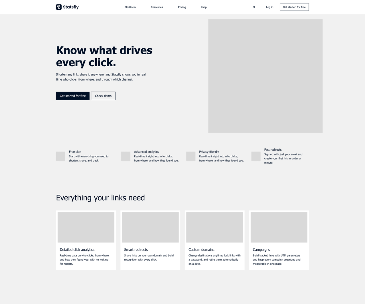
Paper sketches, lo-fi wireframes and the final page, all designed in Figma.
A prerendered Nuxt site in Polish and English, with page copy managed in Sanity and localised URLs for Polish search.
A long feature list Statsfly has click analytics, campaigns, a UTM builder, QR codes and nine link options. Shown at equal weight, they blur together, so the page needed a clear order.
Two languages, one layout Every headline, product view and FAQ answer had to fit the same layout in English and Polish, where words run longer.
Motion that doesn’t slow the page The hero intro and the particle animation in “Links with superpowers” had to play without delaying the first paint or shifting the layout.
I started on paper, moved to lo-fi wireframes and finished the page in Figma, in desktop, wide-desktop and mobile frames. The sections follow the questions a visitor has: what Statsfly does, what it can do with a single link, how it works, what it costs, and in the FAQ, the less comfortable details.
I wanted visitors to see the product at work. The dashboard sits beside the headline from the first paint, and every “How it works” step and feature detail shows the screen it describes, in the visitor’s language. In “Links with superpowers”, particles form a new shape for each link option. The closing call to action sits on a slowly turning globe.
The page is built mobile-first and adapts to every screen, from a 402-pixel phone to a 1920-pixel display. Automated layout tests check every width in between.
None of the motion was allowed to slow the page down. The hero intro is plain CSS. The particles and the globe load only when their section needs them, and everything holds still for visitors who turn animations off. Every page is prerendered in English and Polish, with Polish URLs for Polish search.
Design: Figma Front end: Nuxt, PrimeVue CMS: Sanity Hosting: Netlify
Statsfly now has a complete marketing site that explains the product at a glance, shows it at work and answers the hard questions before anyone signs up. It’s built to load fast on any screen and reads naturally in English and Polish.
5 pages ready for search A home page and four feature pages, each written and built to turn search visits into sign-ups.
2 languages, one site Every page in English and Polish, with Polish URLs so the site can rank in Polish search.
34 reusable components A component library, so new pages and sections can be built from parts that already exist.
All copy editable in Sanity Every headline, price and FAQ answer can be changed without touching code.